
Line Graphs are good for showing trends in many different types of parameters.
To add a line graph to a widget, you should have already followed the instructions to make a widget found here.
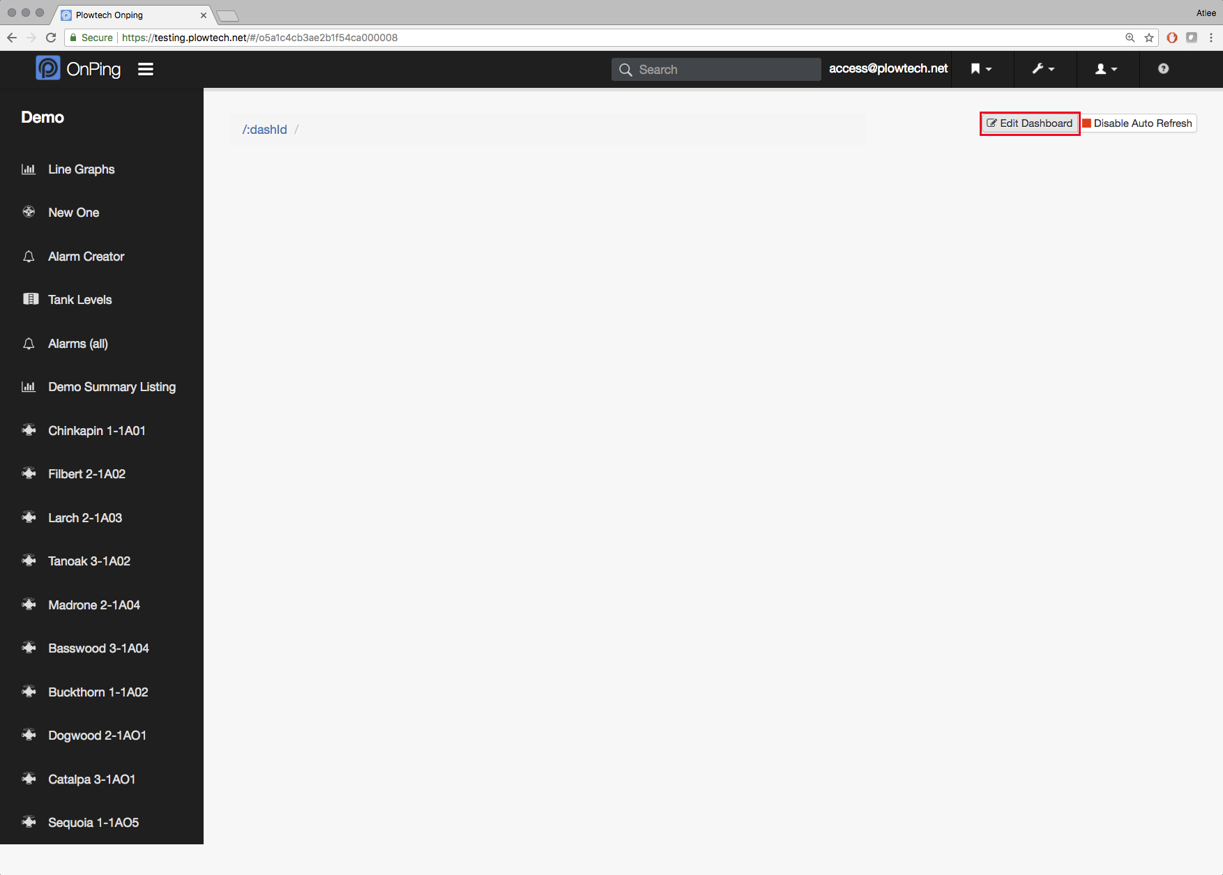
1) To begin, click on " Edit Dashboard" in the top right
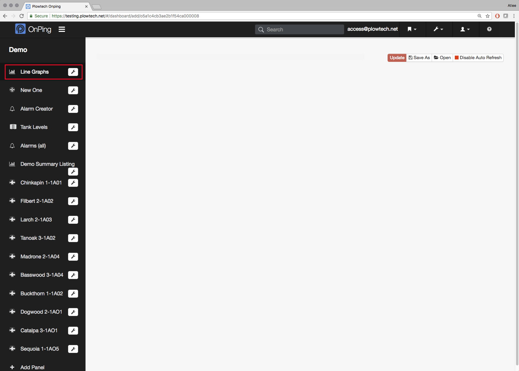
2) Then select the panel where you'd like to put a line graph.
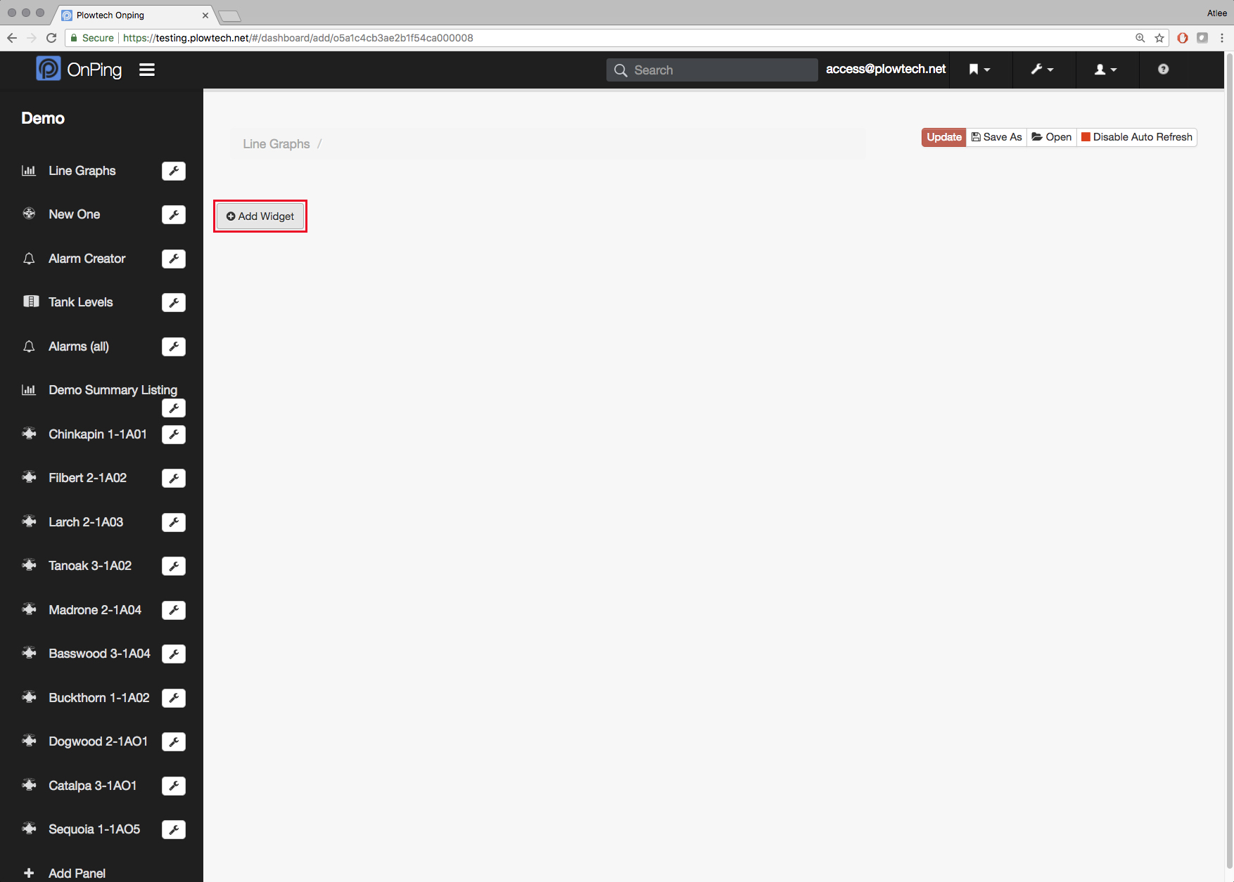
3) Select " Add Widget "
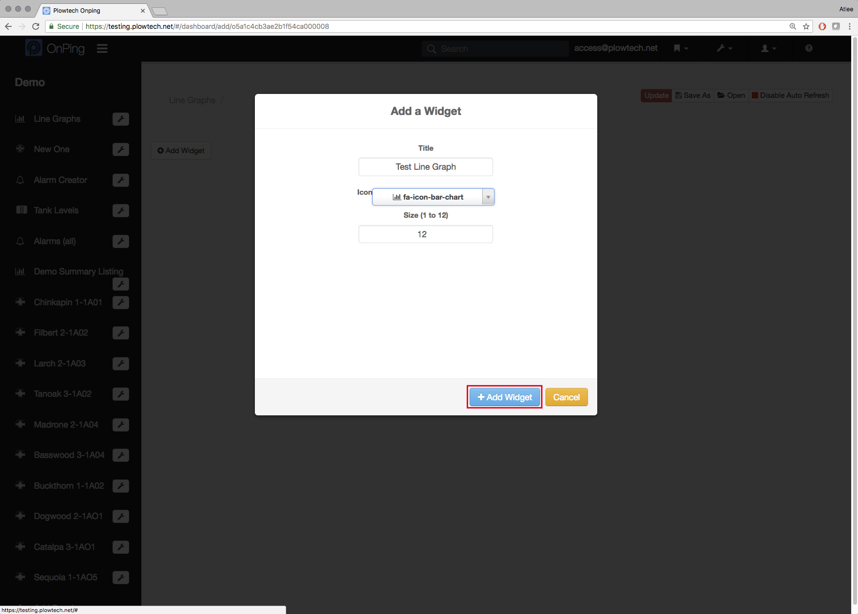
4) Name the widget and select an icon, then click " + Add Widget "
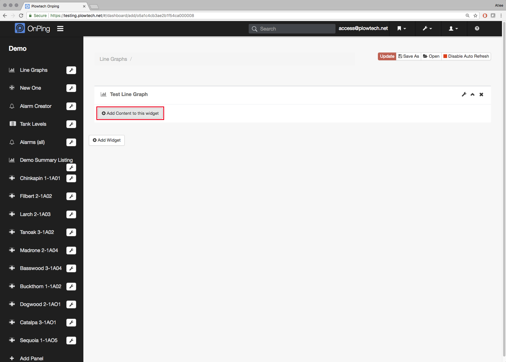
5) Click " Add Content to This Widget "
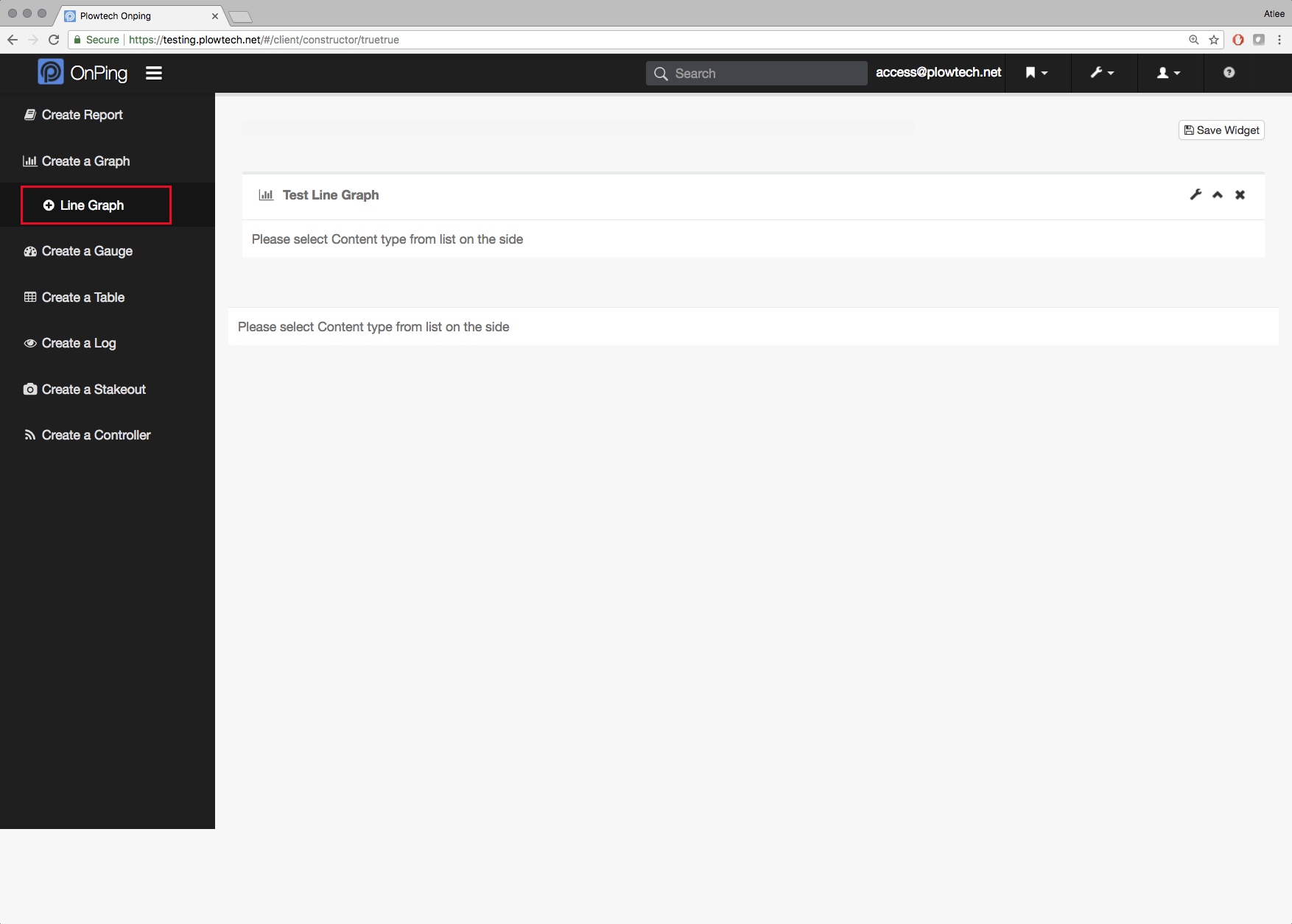
6) Select " Create a Graph " from the menu on the left, and then " Line Graph" right below it.
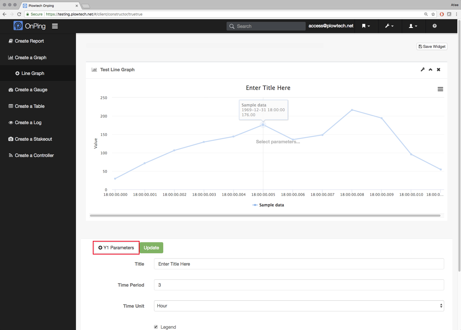
7) The first step to creating a good Line Graph is to tell the OnPing where to pull the data that will be displayed. To start this process, click on " Y1 Parameters "
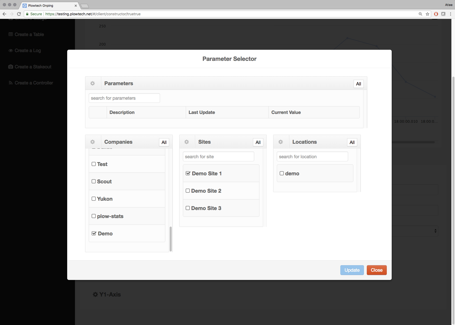
8) Search for the company, site, and location.
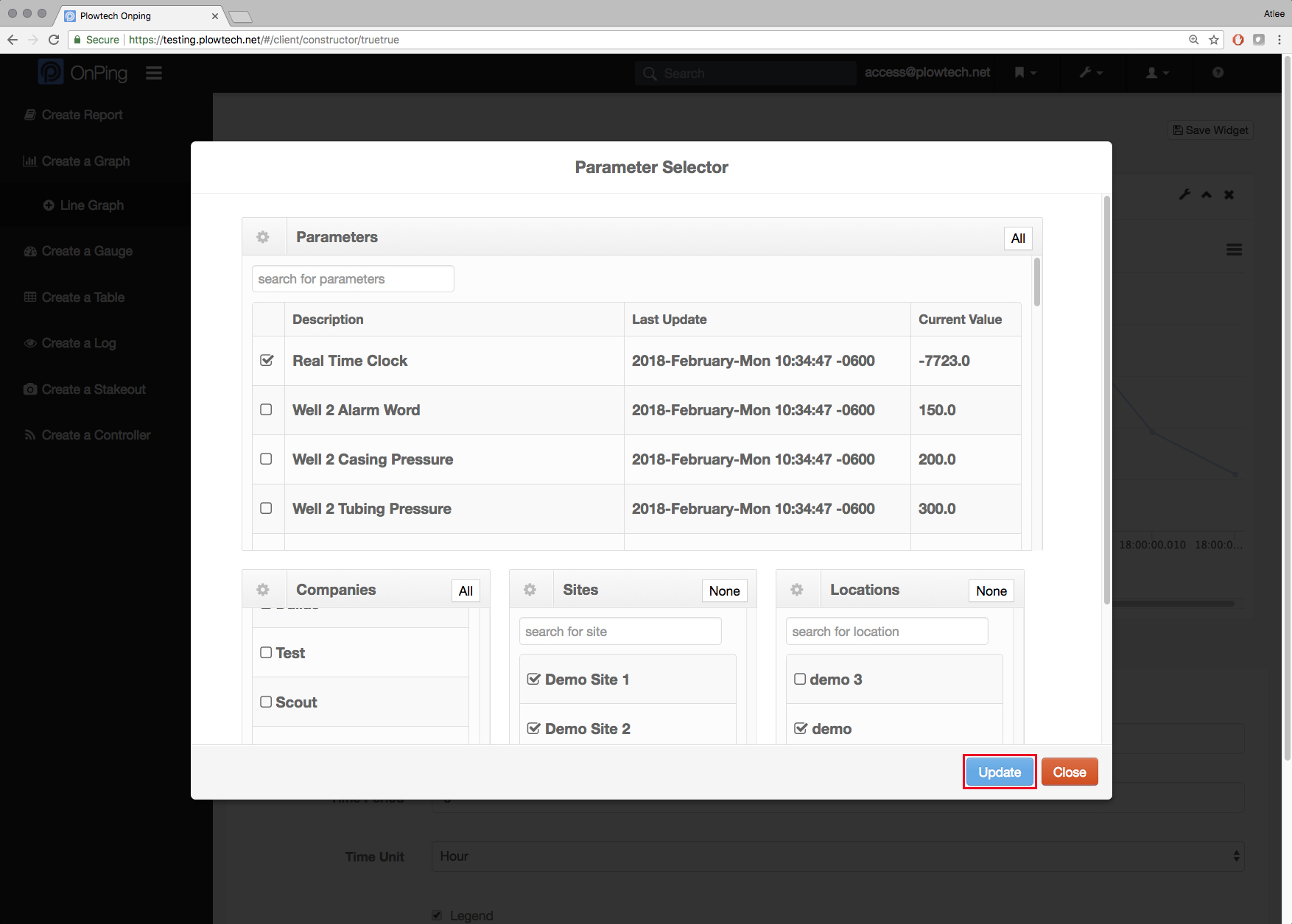
9) This will display all parameters associated with the location. Select all parameters you wish to see on the graph.
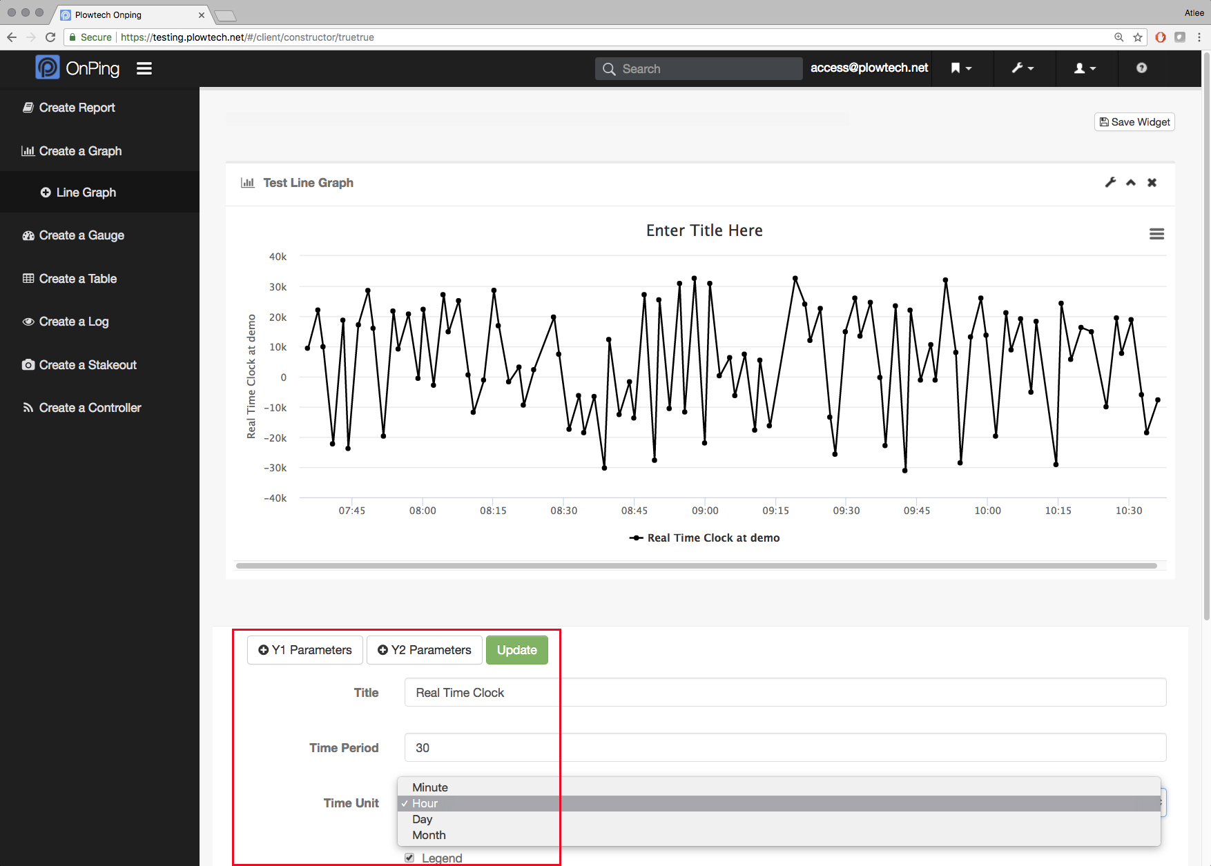
10) You can change the amount of time the graph displays. For this graph I'd like to display the last 30 days, so I am changing the " Time Value " amount to 30, and selecting " Day " from the drop down " Time Unit " menu.
In the " Title " line, I have also given the graph a name. This name will appear at the top of the finished graph.
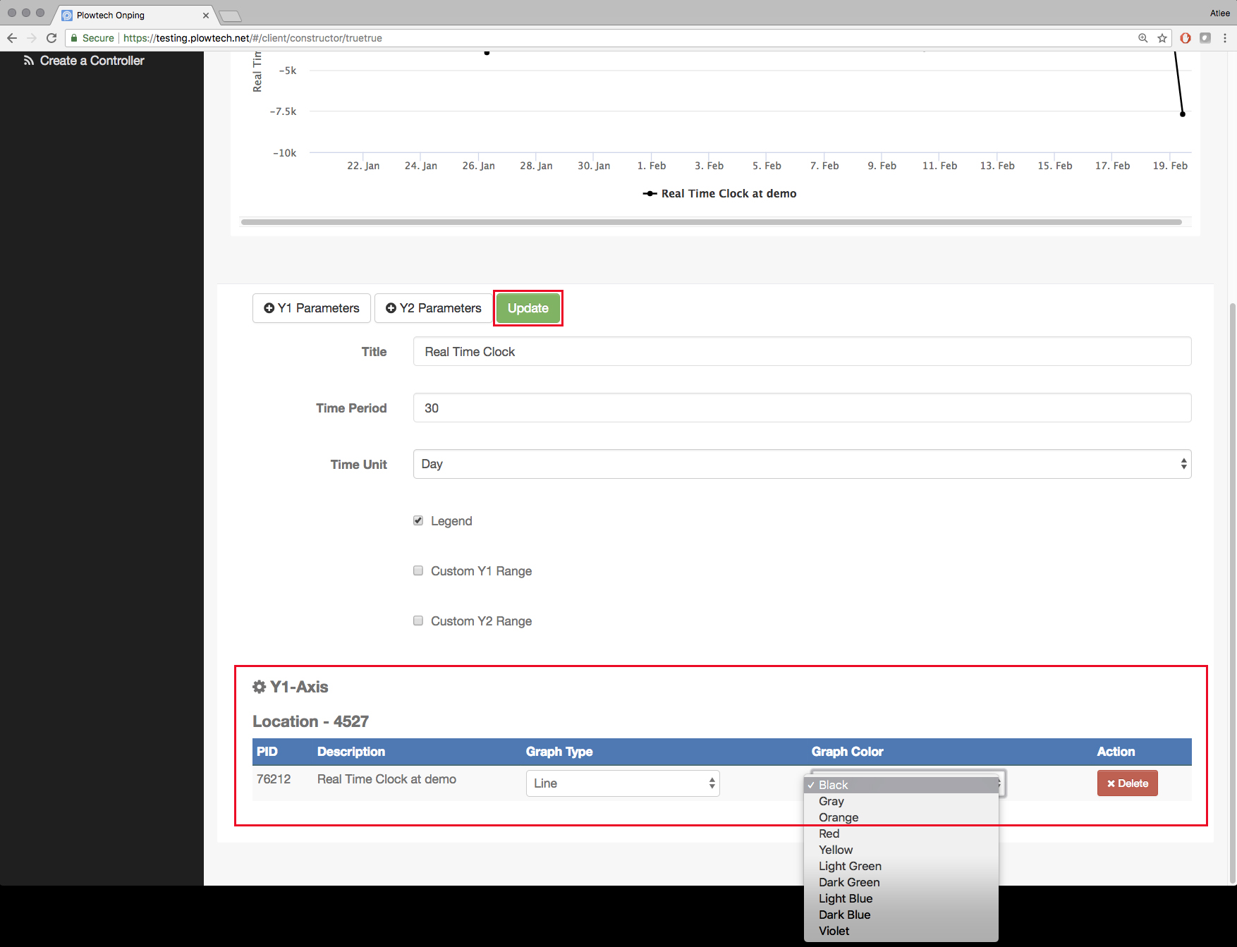
11) You can change the style of the graph as well as the color of the line. Selecting colors for line graphs becomes very useful when you'd like to choose a second parameter to view data from multiple sources to look for differences, overlaps or trends.
12) Once your graph is displaying correctly, click " Save Widget " to make it permanent
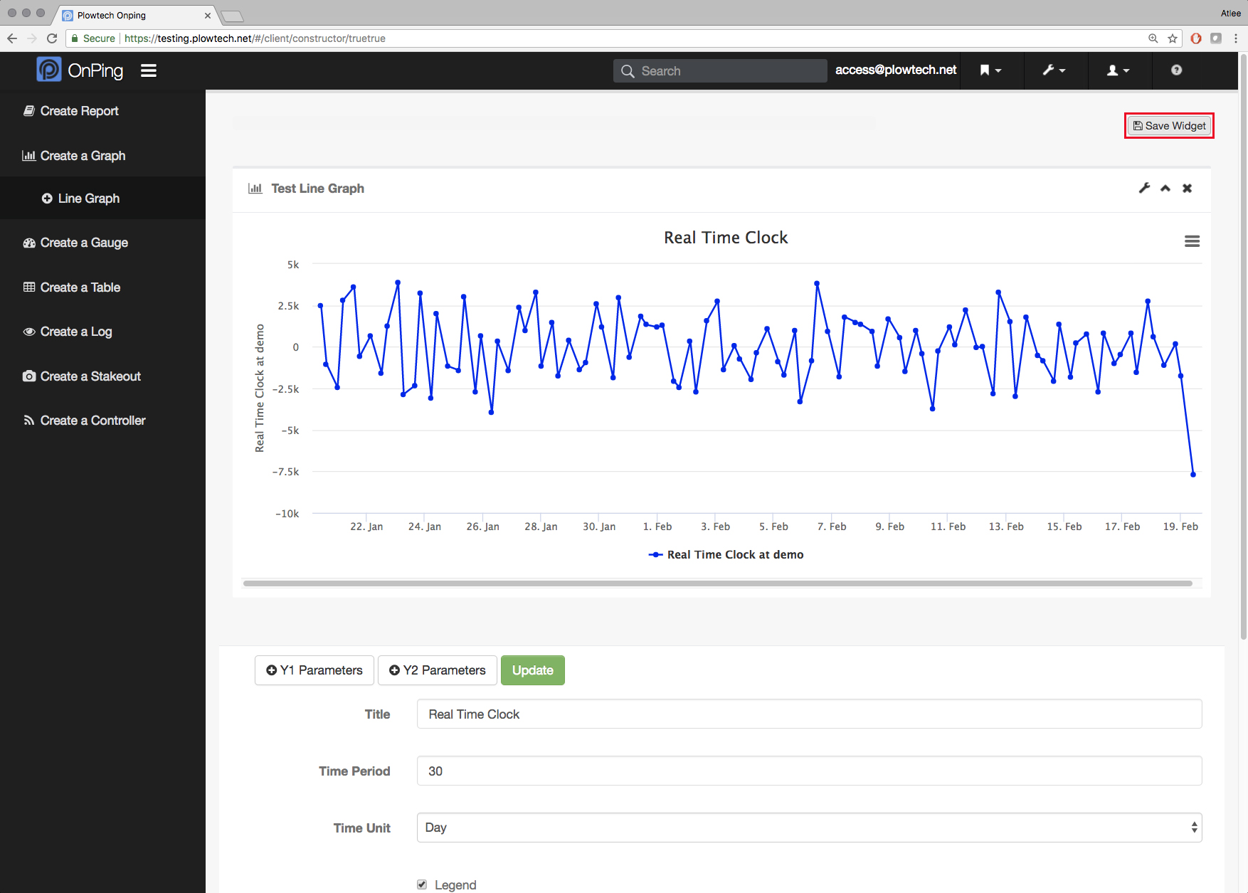
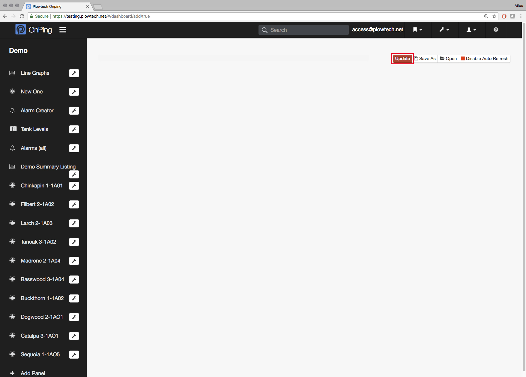
13) Saving the widget will exit the widget, from here click " Update " to save the dashboard and exit the " Edit Dashboard " mode.
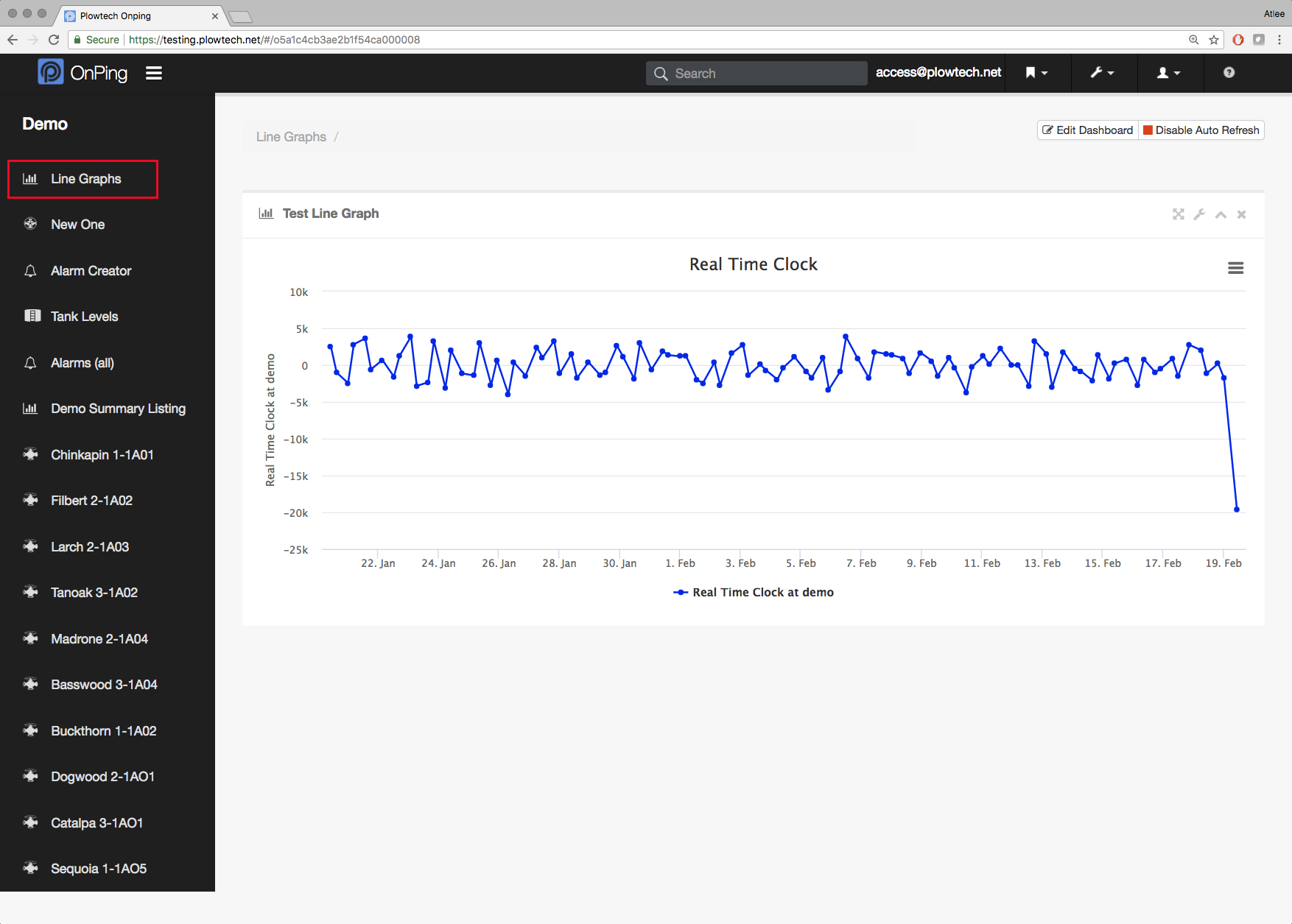
14) You can now click on the panel to view the graph in its final form.
If you have any thoughts, ideas, or questions, please feel free to leave a comment below or use the contact feature at www.onping.net
Comments
0 comments
Please sign in to leave a comment.